Building accessible UI components with Ariakit

Frontend Developer,Javascript,React.
The aim of developers is to lower the obstacles to engagement and communication that many people experience in the real world. In terms of accessibility, the goal is to develop tools and solutions that anyone can use, regardless of their level of ability, the software or hardware, and the location they employ.
Ariakit is a low-level, open-source component toolkit for creating React-based, accessible online applications. We'll show you how to quickly and simply create accessible web applications using Ariakit's components.
Ariakit?
Ariakit is a component library for React that allows you to create applications, design systems, and high-level UI frameworks that are accessible. All components have the right characteristics and keyboard interactions out of the box, and it fully adheres to WAI-ARIA requirements.
Each small, modular Ariakit component only increases your bundle's size by a few bytes to up to 3 kB. It is unstyled by default to allow for full modification.
The fundamentals of Ariakit.
Ariakit is made up of many components and hooks. Attributes and States are the two types of props that each component accepts.
AttributeProps: An attribute is a characteristic of an element that allows access to additional data needed for that element's particular processing of the result. Such props areclassNameandid.
StateProps: For managing and passing the components data such as theuseHovercardState,useFormState, anduseComboboxState.
Prerequisites
You will require the following to continue with the article:
- Working knowledge of JavaScript
- Basic familiarity with React.js
- Most recent Node.js version on your computer Setting up and Installing Ariakit
Start by launching your command-line application. Using the Vite CLI, you can install React if you don't already have a project:
npm create vite@latest
After running the command above, follow the prompt and create your React project. Once completed, the installation of Ariakit and its dependencies can now be started by moving into the project folder by entering the command below:
cd <project folder>
npm install
npm install ariakit
npm run dev
After running the above command, we move into our project via the code editor and create some components.
Session Replay for Developers
Uncover frustrations, understand bugs and fix slowdowns like never before with OpenReplay — an open-source session replay suite for developers. It can be self-hosted in minutes, giving you complete control over your customer data
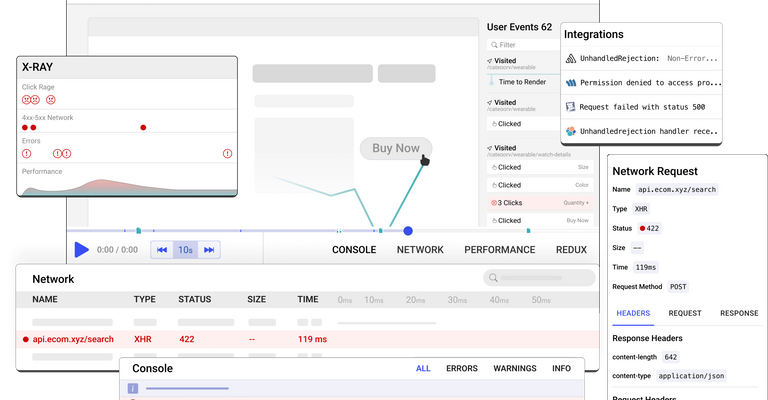 Happy debugging! Try using OpenReplay today.
Ariakit components
Ariakit is a low-level library, yet a high-level API exports all its components. They are, therefore, simpler to use and less complex than other low-level libraries.
Buttons
Users can select options and perform actions by tapping buttons. Buttons convey the actions that users can do. They typically appear in various locations throughout your user interface (UI), including toolbars, modal windows, forms, and cards.
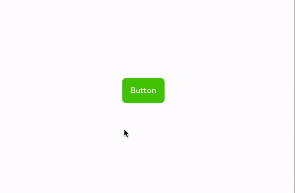
All we have to do is create a button component under our App function, and if we want the button to look more like a link, we'd add an a tag to it.
import { Button } from "ariakit/button";
import "./App.css";
export default function App() {
  return <Button className="button">Button</Button>;
}
So we created a button component with a class attribute button for styling. In our CSS file, we'll have a hover function in which whenever our pointer overs through the button, it switches color between green and red.
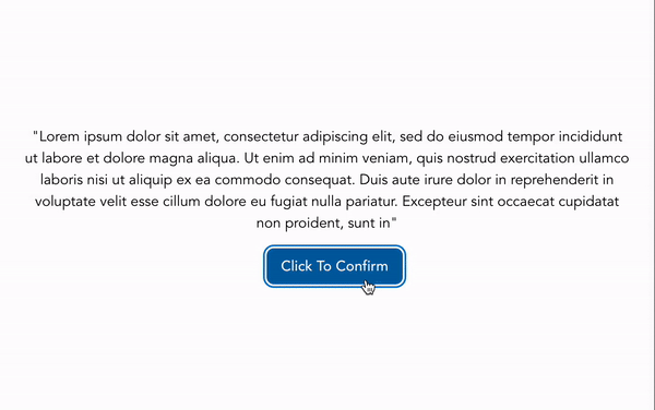
Dialog
A specific type of modal window called a dialog is displayed in front of the app's content to provide crucial information or request feedback. When they appear, dialogs turn off all program functioning and stay on screen until they are acknowledged, dismissed, or necessary action is made.
Here, we'll have to import components such as Button, Dialog, dialogDismiss, DialogHeading, and useDialogState.
import { Button } from "ariakit/button";
import {
  Dialog,
  DialogDismiss,
  DialogHeading,
  useDialogState,
} from "ariakit/dialog";
import "./App.css";
export default function App() {
  const dialog = useDialogState();
  return (
    <>
      <p>"Lorem ipsum dolor sit amet, consectetur adipis..."</p>
      <Button onClick={dialog.toggle} className="button">
        Click To Confirm
      </Button>
      <Dialog state={dialog} className="dialog">
        <h2 className="heading">Affirmed!</h2>
        <p className="description">
          You have successfully confirmed your interest in the ongoing
          contract. We have emailed you further details.
        </p>
        <div>
          <DialogDismiss className="button">OK</DialogDismiss>
        </div>
      </Dialog>
    </>
  );
}
From the above code, we assigned the useDialogState hook to a variable and passed an empty value to it. We also create our dialog with the dialog component, the DialogHeading to create a pop-up header, and DialogDimiss as a button component to close the header.
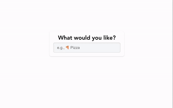
ComboBox
An input value must be selected from a preset range of permitted values to use the combo box's autocomplete (a text input improved by a panel of suggested possibilities) and autosuggest functionalities. To create a combo box component, we'll import the Combobox, ComboboxItem, Comboboxpopover, and useComboboxState.
import {
  Combobox,
  ComboboxItem,
  ComboboxPopover,
  useComboboxState,
} from "ariakit/combobox";
import "./App.css";

export default function App() {
  const combobox = useComboboxState({ gutter: 4, sameWidth: true });
  return (
    <div className="wrapper">
      <label className="label">
        What would you like?
        <Combobox
          state={combobox}
          placeholder="e.g., 🍕 Pizza"
          className= "combobox"
        />
      </label>
      <ComboboxPopover state={combobox} className="popover">
        <ComboboxItem className="combobox-item" value="food1">
          🍔 Hamburger
        </ComboboxItem>
        <ComboboxItem className="combobox-item" value="food2">
          🥞 Pancakes
        </ComboboxItem>
        <ComboboxItem className="combobox-item" value="food3">
          🍨 Ice Cream
        </ComboboxItem>
        <ComboboxItem className="combobox-item" value="food4">
          🍿 Popcorn
        </ComboboxItem>
        <ComboboxItem className="combobox-item" value="food5">
          🍪 Cookies
        </ComboboxItem>
      </ComboboxPopover>
    </div>
  );
}
From the above code block, we create a state hook to a variable and pass a value to it. Then we use the Combobox, ComboboxItem, and Comboboxpopover components to create select, options, and popover elements, respectively.
Disclosure
A list of high-level options on a disclosure display can be expanded or collapsed to disclose more details. To reveal (expand, open) or conceal (collapse, close) a content element in a Tab, click on the corresponding button. For Disclosure, we'll import Disclosure, DisclosureContnent, and useDisclosureState.
import {
Disclosure,
DisclosureContent,
useDisclosureState,
} from "ariakit/disclosure";
import "./App.css";
export default function App() {
const disclosure = useDisclosureState();
return (
<div className="wrapper">
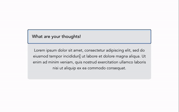
<Disclosure state={disclosure} className="button">
What are your thoughts?
</Disclosure>
<DisclosureContent state={disclosure} className="content">
<p>
Lorem ipsum dolor sit amet, consectetur adipiscing elit, sed do
eiusmod tempor incididunt ut labore et dolore magna aliqua. Ut enim ad
minim veniam, quis nostrud exercitation ullamco laboris nisi ut
aliquip ex ea commodo consequat.
</p>
</DisclosureContent>
</div>
);
}
We'll use the useDisclosureState hook to set the Disclosure element to a default value while the DisclosureContent serves as a dropdown to expand the disclosed content.
Form
Submit data using React's easily accessed interactive controls. Form validation contexts like "Type," "Pattern," and "Required" are built-in elements by Ariakit.
To use the Form component, we must import the Form, FormError, FormInput, FormLabel, FormSubmit, useFormState.
import {
Form,
FormError,
FormInput,
FormLabel,
FormReset,
FormSubmit,
useFormState,
} from "ariakit/form";
import "./App.css";
export default function Example() {
const form = useFormState({ defaultValues: { name: "", email: "" } });
form.useSubmit(async () => {
alert(JSON.stringify(form.values));
});
return (
<Form
state={form}
aria-labelledby="add-new-participant"
className= "wrapper"
>
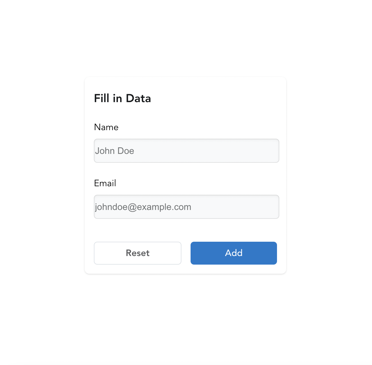
<h2 id="add-new-participant" className="heading">
Fill in Data
</h2>
<div className="field">
<FormLabel name={form.names.name}>Name</FormLabel>
<FormInput name={form.names.name} required placeholder=" John Doe"/>
<FormError name={form.names.name} className="error" />
</div>
<div className="field">
<FormLabel name={form.names.email}>Email</FormLabel>
<FormInput
type= "email"
name={form.names.email}
required
placeholder="johndoe@example.com"
/>
<FormError name={form.names.email} className="error" />
</div>
<div className="buttons">
<FormReset className="button secondary reset">Reset</FormReset>
<FormSubmit className="button">Add</FormSubmit>
</div>
</Form>
);
}
After that, we assign the useFormState hook to a variable and pass an empty value to it. Next, we create the form with the Form component, also the FormLabel and FormInput components to add as many fields. For the FormError component serves as a restriction when a user inputs invalid details as well as the FormSubmit to submit the form once filled.
HoverCard
To assist the user in choosing and learning more about the selected element, you can show a label when the cursor hovers over it. When users hover over an element, HoverCard displays a Popover with more details. We'll import the HoverCard, HovercardAnchor, HovercardHeading, and useHovercardState for this component.
import {
Hovercard,
HovercardAnchor,
HovercardHeading,
useHovercardState,
} from "ariakit/hovercard";
import "./App.css";
export default function App() {
const hovercard = useHovercardState({ gutter: 16 });
return (
<div className="wrapper">
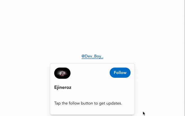
<HovercardAnchor
state={hovercard}
href="https://twitter.com/Dev_Boy_"
className= "anchor"
>
@Dev_Boy_
</HovercardAnchor>
<Hovercard state={hovercard} className="hovercard">
<img
src="https://media.istockphoto.com/id/517671745/photo/water-explosion.jpg"
alt= "Ejineroz"
className= "avatar"
/>
<HovercardHeading className="username">Ejineroz</HovercardHeading>
<p>Tap the follow button to get updates.</p>
<a href="https://twitter.com/Dev_Boy_" className="button">
Follow
</a>
</Hovercard>
</div>
);
}
As usual, the useHovercardState hook will be assigned to a variable, and a default value will be passed onto it. The HovercardAnchor component is similar to an anchor tag for a link element so that when we click, it links to a URL.
Conclusion
An Ariakit component covers the majority of specifications needed to create complete web applications. Although Ariakit's documentation still needs to be improved as of this writing, the website does include a sizable number of component example files.
The tutorial has come to a close. In this tutorial, we learned how to create web components using the Ariakit library in conjunction with a front-end framework React.
Resources